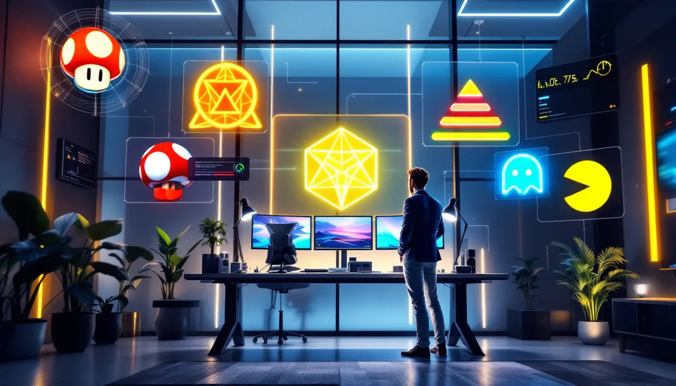

Gaming symbols are everywhere, from the bright yellow coin floating above Mario’s head to the glowing objective markers on your HUD. They’re so woven into how we play that we barely notice them anymore, yet they’re fundamental to how games communicate with players. Whether you’re navigating a sprawling open world, executing a speedrun, or competing in esports, symbols carry meaning that transcends language. They’re the visual shorthand that lets developers tell you instantly what’s dangerous, what’s valuable, and what you need to do next. Understanding gaming symbols reveals not just how games work mechanically, but how an entire medium evolved its own visual language, one that’s now bleeding into our culture beyond the screen.
Key Takeaways
- Gaming symbols are visual representations that communicate information instantly without text, reducing cognitive load and guiding player behavior across all platforms and genres.
- Classic gaming symbols like Mario’s mushroom, Pac-Man’s circle, and the Zelda heart container emerged from hardware limitations but became culturally iconic through their simplicity and universal recognition.
- Modern gaming symbols have evolved into sophisticated UI systems including color-coded health bars, button layouts, minimap icons, and status effects that players parse instantly during intense gameplay.
- Esports amplified the importance of gaming symbols because professional play occurs at speeds where visual communication through ability icons and cooldown rings replaces text-based explanations for viewers and commentators.
- Gaming symbols have transcended entertainment to become genuine cultural artifacts, appearing in tattoos, fashion, street art, and mainstream media as proof of their design effectiveness beyond the screen.
- Accessibility and contextual symbol design have become critical to modern development, with developers using color plus shape distinction and dynamic meanings to ensure clarity for all players and communities.
What Are Gaming Symbols And Why Do They Matter
Gaming symbols are visual representations, icons, glyphs, colors, and shapes, that communicate information to the player without requiring text or voice explanation. They’re the grammar of game design, a universal language that works whether you’re playing in English, Japanese, or any other language.
At their core, gaming symbols serve three critical functions: they provide instant information, they guide player behavior, and they create emotional resonance. When you see a red bar shrinking, you know your health is dropping. A skull icon signals danger. A glowing path shows you where to go. This isn’t accidental, developers spend considerable time designing symbol systems that feel intuitive the moment a player encounters them.
Why does this matter? Because symbols reduce cognitive load. Instead of reading “You have 45 health points remaining,” a simple bar graphic conveys the same information in milliseconds. In competitive games with split-second decision windows, this difference is life or death. In single-player experiences, it’s the difference between immersion and constant menu-checking.
Beyond mechanics, symbols carry cultural weight. The mushroom in Super Mario isn’t just a power-up: it’s become iconic shorthand for the entire Nintendo legacy. Gaming symbols have escaped the screen, they appear on merchandise, in tattoos, in street art. They’re symbols that gamers recognize instantly and that non-gamers increasingly understand through cultural osmosis. That’s the mark of genuinely effective design.
Classic Gaming Symbols That Defined Retro Gaming
The earliest gaming symbols emerged from hardware limitations. When programmers couldn’t render complex visuals or include voice acting, they relied on abstract icons and color coding to convey meaning. Those constraints actually created the most memorable symbols in gaming history.
The Power-Up Symbols And Their Evolution
Power-ups are gaming’s most enduring symbol category. The Super Mario Bros. mushroom (1985) stands as the prototype, a simple, instantly recognizable shape that signals growth and strength. Its descendants are everywhere: mushrooms in RPGs that restore health, fire flowers that grant temporary weapon upgrades, stars that grant invincibility. The brilliance is that the symbol works universally. A mushroom looks nourishing. Fire looks dangerous and powerful. Stars suggest something transcendent.
The Sonic the Hedgehog rings (1991) evolved the power-up concept differently. Rings served dual purposes: they represented your health (lose all rings, lose a life) and acted as collectibles that granted points. The floating ring became visual shorthand for “value” in platformers, an iconography so effective that 35 years later, ring-based collection mechanics still feel natural to players.
The The Legend of Zelda heart containers (1986) introduced color-coded health that influenced decades of game design. The heart symbol carries emotional weight, it’s healing, it’s life force, it’s the literal center of your survival. That symbolic weight made health feel personal rather than just a statistical bar.
Power-up symbols evolved in complexity alongside hardware. Early 16-bit games could render more detailed graphics, yet the most memorable power-ups remained simple: the Morph Ball in Metroid (1986) instantly communicated a transformation in a single visual frame. Modern games maintain this principle, even with photorealistic graphics, the most effective power-ups use symbolic shapes that read clearly at a glance.
Iconic Characters As Visual Symbols
Characters themselves became symbols. Pac-Man (1980) might be the single most recognizable gaming symbol ever created, a circle with a wedge removed. That simplicity is what made it transcendent. The design works as a symbol, as a character, as a logo, as a meme. It scaled from arcade cabinets to merchandise to cultural consciousness.
Mario transformed from “Jumpman” (1981) into a symbol of gaming itself. His distinctive silhouette, the red cap, the mustache, the overalls, became so iconic that Nintendo could reduce him to pure visual shorthand. In later games, a tiny pixel sprite of Mario remains unmistakable. Other characters followed: Donkey Kong’s barrel roll, Kirby’s puffball aesthetic, Link’s green tunic and pointed hat.
These character symbols worked for developers too. They provided instant brand recognition. A gamer seeing Mario’s silhouette didn’t need to read “Nintendo Game” or “officially licensed.” The symbol said everything. This principle remains central to modern gaming marketing, developers design characters with symbolic clarity in mind, knowing they’ll appear in countless contexts beyond the game itself.
Modern Console And PC Gaming Symbols
As games became more complex, symbol systems evolved to match. Modern AAA titles juggle dozens of simultaneous symbols, UI elements, status indicators, directional cues, and contextual prompts. The challenge for developers became preventing symbol overload while keeping information accessible.
Controller Button Symbols And Universal Input Design
Console gaming introduced standardized controller button symbols, and they’re more important than most players realize. The PlayStation button layout (triangle, circle, X, square) uses color-coding that’s become globally recognizable. Triangle points up (forward/confirm). Square suggests a menu option. X is negative/cancel. Circle is accessible/back. This wasn’t arbitrary, it was designed for intuitive spatial reasoning.
Xbox’s button layout (Y, X, B, A) uses letters, which seems less sophisticated until you realize the A-B-X-Y layout became industry standard for standardizing actions. When developers design for multiple platforms, these button symbols carry meaning across contexts.
The genius of modern button symbols is their cross-platform adaptation. A PlayStation symbol on your phone screen tells you which button to press on a controller you might not have in front of you. When you see “Press [X]” in a game guide, that symbol transcends the physical button, it’s visual language.
Recent developments in accessibility design have refined button symbols further. Input remapping in modern games (across PC, PS5, Xbox Series X
|
S) means the symbol layout might differ from physical buttons, requiring developers to use context symbols rather than relying on button placement.
UI And HUD Symbols In Contemporary Games
Modern game interfaces are essentially symbol systems. Health bars remain ubiquitous, but they’ve evolved layered symbology: red for damage taken, yellow for shields, white for armor absorption. Players instantly parse these distinctions in real-time, a skill that would be impossible without refined symbol design.
Minimap symbols represent entire gameplay concepts through icons. A filled circle might mean “ally.” An outline circle means “enemy.” A dot means “objective.” A star might mean “collectible.” The sophistication lies in making these distinctions instantly readable during intense gameplay.
Status effect icons (buffs, debuffs, cooldowns) became standardized across genres. A blue icon suggests defensive benefits. Orange or red suggests negative status. Purple suggests magical effects. Modern RPGs and MOBAs lean heavily on these color-coded symbols, players recognize the visual pattern even if the specific icon is new.
Darksouls’ estus flask symbol became so iconic that it influenced how other games represent healing items. The gourd-shaped flask is instantly recognizable to the franchise’s audience, yet it transcended From Software games. The aesthetic influenced design across the industry, hollow corporate healing symbols gave way to more interesting, character-driven shapes.
Recent games push symbol innovation further. Elden Ring’s grace sites (golden wisps marking fast travel points) created new visual language, players immediately understood their function even though no tutorial explanation. That’s symbol design at its finest: the visual communicates the purpose instantly.
Gaming Symbols In Esports And Competitive Gaming
Esports amplified the importance of gaming symbols. Professional play happens at speeds that make text-based communication impossible. Symbol systems had to become crystal clear because millions of viewers depend on them to understand what’s happening.
Take Valorant’s ability icons. Each Agent has five distinct ability symbols (four purchasable abilities plus their ultimate). Experienced viewers recognize these glowing icons instantly, they signal what plays are possible, what utility is available, and what strategic options remain. The symbols create narrative clarity in chaotic moments. A viewer who’s never played Valorant still understands the game through its symbol system.
League of Legends’ cooldown rings represent a refinement of symbol design for spectatorship. Each ability icon shrinks as its cooldown progresses, creating a visual timer. Casters and viewers understand resource availability through symbol language rather than reading stat numbers. This single design choice transformed how esports audiences engage with competitive play.
Esports broadcasting created demand for symbol standardization. Game Informer’s coverage of major esports events shows how symbol systems enable commentary. Broadcasters can reference ability symbols, item builds (represented through item icons), and status effects through pure visual communication, no explanation needed.
CS:GO/CS2’s weapon economy is built on symbol language. Buy rounds are communicated through the visual representation of weapons, experienced players understand the entire team’s buy through quick glances at weapon icons. That symbol language is what separates “full buy” from “force buy” at a glance.
Competitive rank symbols also matter enormously. Whether it’s Overwatch’s seasonal ranks, Valorant’s radiant markers, or Apex Legends’ ranked symbols, these icons carry weight in player identity. Grinding for a symbol that represents your skill level is fundamental to competitive psychology. The symbol becomes proof of accomplishment.
How Developers Use Symbols For Player Guidance And Immersion
Master game designers understand that symbol systems must simultaneously be invisible and crystal clear. When a symbol system works perfectly, players don’t consciously register it, they just understand. When it fails, players get lost and frustrated.
Environmental symbol design shapes how players navigate open worlds. Yellow markers typically indicate optional content. Red markers indicate enemies. Blue markers indicate allied NPCs. Open-world games from Ubisoft standardized this approach so thoroughly that players expect these color schemes across most titles. The symbols create narrative hierarchy, main objectives feel different from side quests through visual distinction alone.
Immersive symbol design tries to make symbols feel native to the game world. Games like The Witcher 3 use quest markers that appear in the environment as actual objects (glowing markers, NPCs waiting at locations) rather than pure UI elements floating over the screen. This breaks immersion less while maintaining clarity. Elden Ring took this further, it provides guidance without constant markers, letting players discover through environmental symbols (the golden guidance lines, site of grace imagery).
Color psychology is fundamental to symbol effectiveness. Red almost universally signals danger or enemy status across games. Green signals safety, healing, or positive effects. Yellow suggests caution or resource scarcity. This isn’t universal law, it’s learned player expectation built through thousands of games. Developers who violate these expectations (using red for friendly units, for example) have to work harder to teach new symbol meanings.
Accessibility and symbol design have become increasingly important. Game Rant’s recent features highlight how developers like Naughty Dog and Sucker Punch built accessible symbol systems. This means using multiple visual indicators (color plus shape distinction) so colorblind players understand status effects. It means making icons large enough for players with vision impairments. It means ensuring symbols remain clear even when accessibility filters are applied.
Developers use onboarding symbols to teach new players. Tutorial levels introduce symbols gradually, reinforcing them through repetition. A new symbol appears, then the game immediately forces you to interact with it. By the time you leave the tutorial, the symbols feel native rather than learned.
Dynamic symbols change meaning based on context. In Souls-like games, the same symbol might mean different things depending on state (a bonfire is resting point when you’re alive, phantom spawn location when you’re in multiplayer). This contextual symbol language makes exploration feel like learning a grammar rather than memorizing arbitrary rules.
Gaming Symbols Across Mobile And Cross-Platform Gaming
Mobile gaming created new symbol design challenges. Touchscreen interfaces don’t have standardized buttons, so mobile games had to develop visual symbols for actions that console games could offload to distinct buttons.
Mobile gesture symbols emerged to communicate different interaction types. A circular arrow symbol indicates “rotate.” A pinch symbol means “zoom.” A swipe arrow shows “swipe to continue.” These symbols had to be self-explanatory because players wouldn’t tolerate lengthy tutorials on a five-minute coffee break game.
Cross-platform gaming created symbol standardization pressure. When the same game runs on PC, PS5, Xbox, Nintendo Switch, and mobile devices, symbol systems had to be platform-agnostic. Fortnite’s UI symbols work identically whether you’re playing on Switch (physical buttons) or mobile (touch). The symbols transcend the input method, they communicate pure game information.
Gacha game symbols (common in mobile gaming) created entirely new visual language around probability and collectibility. Rarity symbols (stars, borders, colors) instantly communicate how rare or powerful a character is. These symbols drive entire economies, players understand pulling a rare unit through its symbol border before seeing actual stats. This symbol language is so standardized that players immediately recognize it across any gacha title.
Free-to-play symbol systems often include monetization symbols alongside gameplay symbols. Battle pass tier icons, premium currency symbols, and cosmetic rarities all communicate value through visual language. The challenge for ethical game design is preventing these monetization symbols from overshadowing actual gameplay symbols.
Recent mobile releases show sophisticated symbol design even on limited screens. Honkai: Star Rail’s turn-order symbols, Genshin Impact’s elemental icons, and Zenless Zone Zero’s action symbols all pack detailed information into small spaces. These games prove that symbol systems can be both beautiful and functionally clear, the symbols carry aesthetic weight while conveying critical gameplay information.
The Cultural Impact Of Gaming Symbols Beyond Gaming
Gaming symbols have transcended entertainment to become genuine cultural artifacts. This happened because symbols that work in games, clear, intuitive, emotionally resonant, work in culture too.
The Triforce from The Legend of Zelda might be gaming’s most successful symbol escape. It appears in tattoos, fashion design, street art, and fine art contexts. The symbol carries meaning even for people who’ve never played Zelda, it suggests legend, treasure, and hierarchy. NME Gaming’s coverage of how gaming influences mainstream culture shows this symbol migration happening in real-time across music, fashion, and visual arts.
Minecraft’s simplistic blocky aesthetic created symbols that became culturally recognizable. A pixelated creeper face means something to people who’ve never launched the game. The symbol has become shorthand for “gaming’s digital nature” in mainstream media.
The Dark Souls bonfires and “Praise the Sun” gesture evolved from game symbol to cultural meme and back again. The symbol means something specific to players (save point, spiritual significance) but transformed into broader internet culture as shorthand for relief, sanctuary, and community. The symbol carries meaning even in contexts completely divorced from gaming.
Twitch and streaming symbols have created new symbol language. The chat emotes, PogU, KEKW, monkaS, are symbols that communicate emotional reactions in pure visual/textual form. Non-streamers increasingly recognize these symbols through cultural osmosis. They’ve become symbols of a particular internet community.
Esports team logos function as cultural symbols now. A League of Legends team crest or Valorant organization symbol carries cultural weight similar to sports team logos. Fans buy merchandise featuring these symbols, wearing them as identity markers.
The spread of gaming symbols into mainstream culture indicates something profound: games created a visual language so effective that culture at large adopted it. When mainstream fashion brands reference gaming symbols in their designs, when musicians use gaming aesthetics in music videos, when non-gamers recognize gaming symbols, that’s evidence of symbols that transcended their original context through pure design effectiveness.
Conclusion
Gaming symbols represent far more than visual shortcuts, they’re the fundamental vocabulary through which games communicate with players and through which players understand each other. From the simple power-up mushroom to sophisticated esports UI systems, symbols have evolved alongside gaming itself, growing more sophisticated while maintaining the clarity that made early symbols effective.
What’s remarkable is how these symbols have achieved what most communication systems struggle with: universal recognition without requiring explanation. A player can encounter a symbol they’ve never seen before and, through smart design, immediately understand its meaning. That’s the hallmark of a mature symbolic language.
As games continue evolving, with new platforms, new genres, and new player communities, the importance of symbol design only increases. Whether you’re a casual player appreciating a game’s visual language or a designer crafting systems for millions, understanding gaming symbols matters. They’re how we collectively understand play, and they’re increasingly how we communicate beyond gaming itself. The symbols we create in games today might be the cultural shorthand of tomorrow.